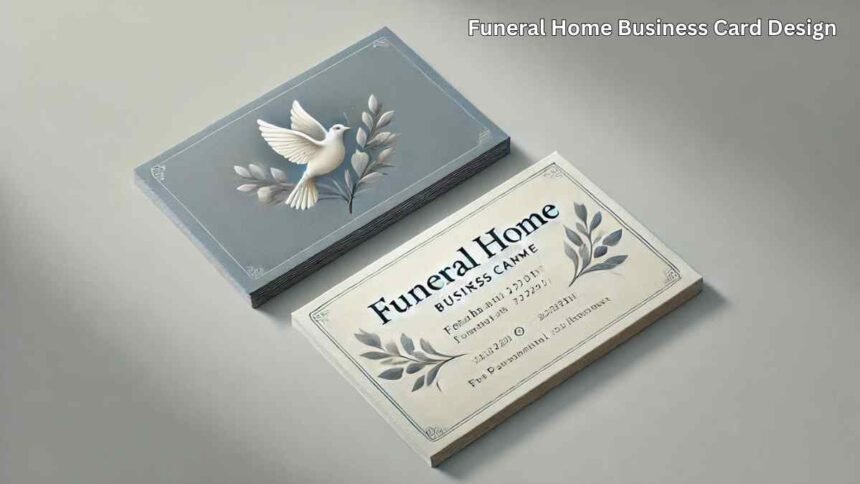
Creating a funeral home business card design requires a delicate balance of professionalism, compassion, and clear communication. The design should reflect the solemnity of the services offered while providing essential contact information in a way that is easy to read and aesthetically pleasing. Opting for calming colors, simple yet elegant fonts, and a layout that prioritizes the key details can help your business card stand out, leaving a lasting, respectful impression on those who receive it.
Introduction
In the funeral home industry, first impressions are vital, and one of the most effective ways to make a lasting impact is through a well-crafted business card. Unlike other businesses, a funeral home’s card design must convey a sense of compassion, trust, and professionalism. This article delves into the essentials of creating a funeral home business card that not only represents your brand effectively but also resonates with clients during their most difficult times.
Understanding the Importance of Design in Funeral Home Business Cards
The design of a business card for a funeral home is more than just an aesthetic choice; it is a reflection of your business’s values and services. A well-designed card can communicate the sensitivity and professionalism that clients expect from a funeral service provider. This section will explore why the design matters and how it influences the perception of your business.
Essential Elements of a Funeral Home Business Card Design
1. Choosing the Right Color Palette
The color palette of a funeral home business card should be calming and serene. Colors like soft blues, greys, and muted earth tones are often preferred as they evoke a sense of peace and solemnity. This section will discuss how to select the right colors that align with your brand and the message you want to convey.
2. Typography: Fonts That Speak Volumes
Typography plays a crucial role in conveying the right tone. The fonts used should be simple, legible, and elegant. Serif fonts are often chosen for their classic and traditional appearance, which can help to convey a sense of respect and dignity. This section will guide you on choosing the appropriate typography for your funeral home business card.
3. Incorporating Symbolism and Imagery
Symbolism and imagery can be powerful tools in the design of a funeral home business card. Subtle use of symbols like doves, crosses, or flowers can add a touch of meaning and respectfulness. However, these should be used sparingly to avoid overwhelming the design. This section will explore the types of imagery that work well in this context.
4. Crafting a Clear and Professional Layout
A business card must be easy to read and navigate. The layout should prioritize essential information such as the business name, contact details, and perhaps a tagline that reflects your mission. This section will discuss how to arrange these elements on the card for maximum impact.
5. Material Matters: Choosing the Right Paper
The choice of paper can significantly impact the overall feel of your business card. Thick, high-quality paper can convey a sense of permanence and professionalism. This section will cover the different types of paper available and how to choose the one that best suits your business.
Best Practices for Printing and Distributing Your Business Cards
Once the design is finalized, the next step is printing and distribution. High-quality printing is essential to ensure that the design elements are reproduced accurately. This section will offer tips on selecting a printing service and strategies for distributing your business cards to potential clients and partners.
Case Studies: Examples of Effective Funeral Home Business Cards
Examining successful examples of funeral home business cards can provide inspiration for your design. This section will showcase a few real-world examples and analyze what makes them effective, offering insights that you can apply to your own design process.
Avoiding Common Pitfalls in Funeral Home Business Card Design
Even with the best intentions, it’s easy to make mistakes in the design process. This section will highlight common pitfalls such as cluttered layouts, overly bright colors, or using inappropriate imagery, and provide advice on how to avoid these issues.
How to Evolve Your Business Card Design Over Time
As your funeral home business grows, so too should your business card design. This section will discuss how to update your design to reflect changes in your services, branding, or target audience, ensuring that your business card remains a relevant and effective tool.
Conclusion
A thoughtfully designed funeral home business card is more than just a piece of paper; it is a crucial part of your brand’s identity. By carefully considering the elements discussed in this article, you can create a business card that not only provides essential information but also leaves a lasting, respectful impression on those who receive it.
For More Visit, Viraltimes.co.uk


